Enterprise Data Analytics
The Challenge
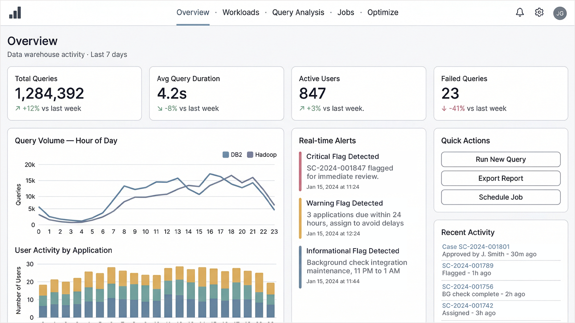
Enterprise data warehouse systems generate enormous volumes of operational data like query loads, job performance, storage utilization, system bottlenecks, which are all things that organizations depend on to make infrastructure decisions worth millions of dollars. The platform I was brought in to redesign had been built by engineers, for engineers. It worked, but it primarily worked only for the people who already understood the underlying architecture, which meant that the insights it contained were effectively invisible to the people who most needed to act on them: operations managers, finance leads, and executives who controlled budget and infrastructure decisions.
The interface was dense, monochromatic, and assumed a level of technical fluency that most of its intended audience didn't have.
The Tension
The hardest part of this project was parsing the competing demands of the people who used it. The engineers and database administrators who lived in the system every day needed full technical depth: raw query counts, job elapsed times, HDFS byte metrics, multi-platform comparisons across DB2 and Hadoop simultaneously. They were skeptical of any simplification that might obscure information they relied on.
The executives and operations managers needed something different: a clear picture of how the data infrastructure was performing, where the bottlenecks were, and what was being used versus sitting idle. Designing for both groups simultaneously, without creating two separate products, was the central problem.
The Approach
The solution was a layered information architecture that let each user type access the level of detail appropriate to their role without either group feeling the interface was designed for someone else.
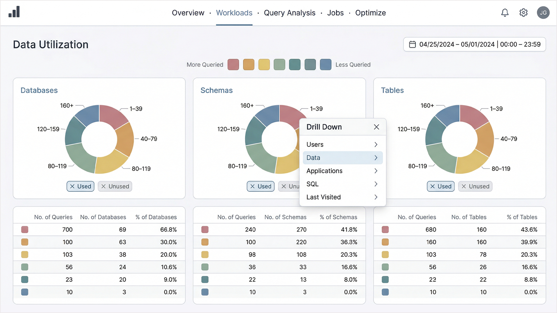
The top layer, the Data Utilization view, presented a color-encoded frequency system across Databases, Schemas, and Tables. A graduated spectrum from more queried to less queried gave executives an immediate spatial understanding of where activity was concentrated and where resources were sitting unused. The color encoding was functional, not decorative. Each segment carried meaning that could be read at a glance without understanding the underlying data model.
For users who needed to go deeper, a drill-down menu architecture gave access to five dimensions: Users, Data, Applications, SQL, Last Visited, all from a single interaction point. The system revealed complexity progressively rather than presenting it all at once. An engineer drilling into SQL query patterns and an operations manager reviewing application usage were navigating the same interface, just at different depths.
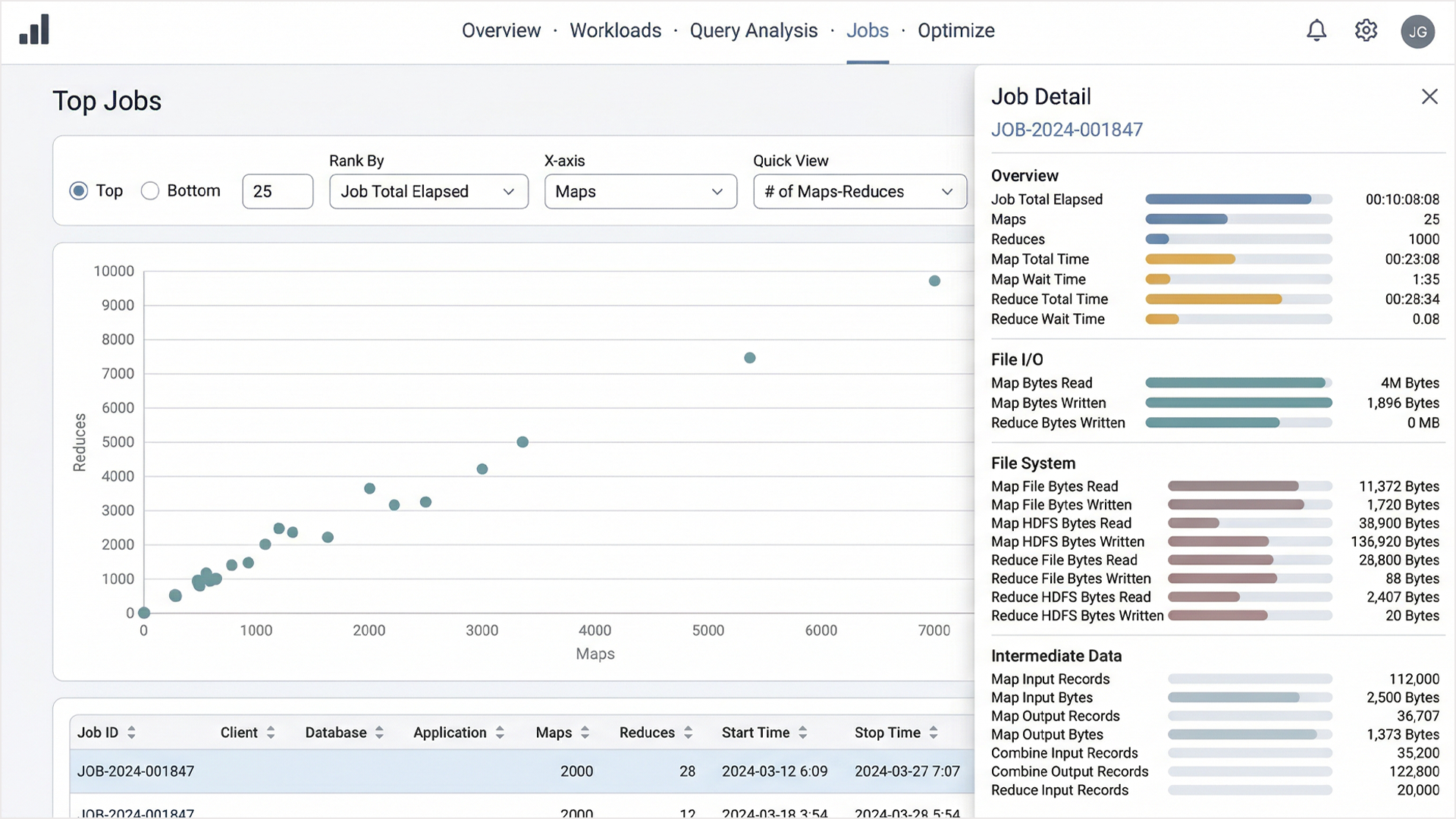
The Top Jobs scatter plot addressed the performance analysis workflow specifically for technical users. Plotting jobs by Maps versus Reduces with a configurable ranking system allowed database administrators to identify outliers and performance anomalies visually rather than parsing raw tables. Selecting a data point opened a slide-out detail panel with a complete breakdown across Overview, File I/O, File System, and Intermediate Data metrics, which is everything an engineer needed without cluttering the primary view.
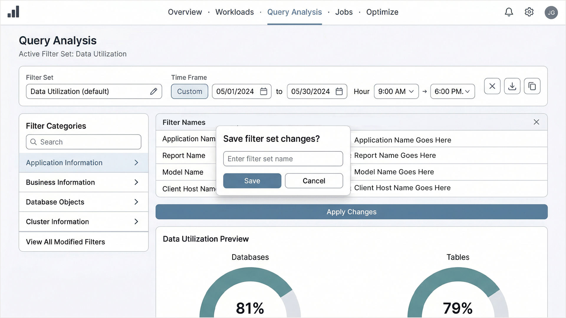
The Active Filter Set system allowed users to define, save, and reapply complex filter configurations across time ranges and data dimensions. This addressed one of the most consistent pain points in the original system: users were repeatedly reconstructing the same queries from scratch because there was no way to preserve their working context.
The Outcome
The redesign shipped after several months of research, iteration, and close collaboration with engineering and product stakeholders. The work demonstrated that technical complexity and usability are not mutually exclusive and that a system can be simultaneously rigorous enough for engineers and legible enough for the people who fund the infrastructure they build.