Government Security Clearance Portal
The Challenge
Security clearance processing is painstaking, high-stakes work. Reviewers manage dozens of active cases simultaneously, each requiring background checks, reference interviews, financial reviews, psychological evaluations, and careful documentation across weeks or months of investigation. A single case involves multiple reviewers, multiple document types, and multiple decision points, all of which need to be tracked, accessed, and acted on without losing context or missing a deadline.
The existing platform made this harder than it needed to be. It was functional but disorienting, a system that processed information without helping the people using it understand where they were, how they got there, or how to get back.
The Research
Before any design work began, I spent time observing the people who actually used the software. This meant watching the people who sat in front of the system every day, inputting information, conducting screenings, and moving cases through the adjudication process.
Watching them work revealed problems that no requirements document would have surfaced. The most consistent and consequential was navigation. Reviewers were getting lost. A case would take them several layers deep into the system, into a specific document, a specific review stage, a specific applicant record and getting back to their queue required retracing steps that the interface didn't support clearly. They were rebuilding their context repeatedly throughout the day, which cost time and introduced error.
The second problem was persistent information. Information that was relevant across the entire review process including case status, priority level, assigned reviewer, upcoming deadlines all disappeared when you navigated away from the screen where it lived. Reviewers were memorizing or writing down information that the system should have been holding for them.
The third was orientation was that at any given moment in the workflow, reviewers struggled to answer a simple question: where am I in this case? What has been completed, what is in progress, and what still needs to happen?
The Approach
The redesign was built on ServiceNow, which meant working within a defined platform rather than designing from scratch. This is a more constrained problem and in some ways a harder one. The question is not what the ideal solution would be, but what the best possible solution is within the constraints of an existing system. Every design decision had to be both right for the user and technically achievable within the platform.
The three research findings drove three persistent design patterns that appear across every screen in the system.
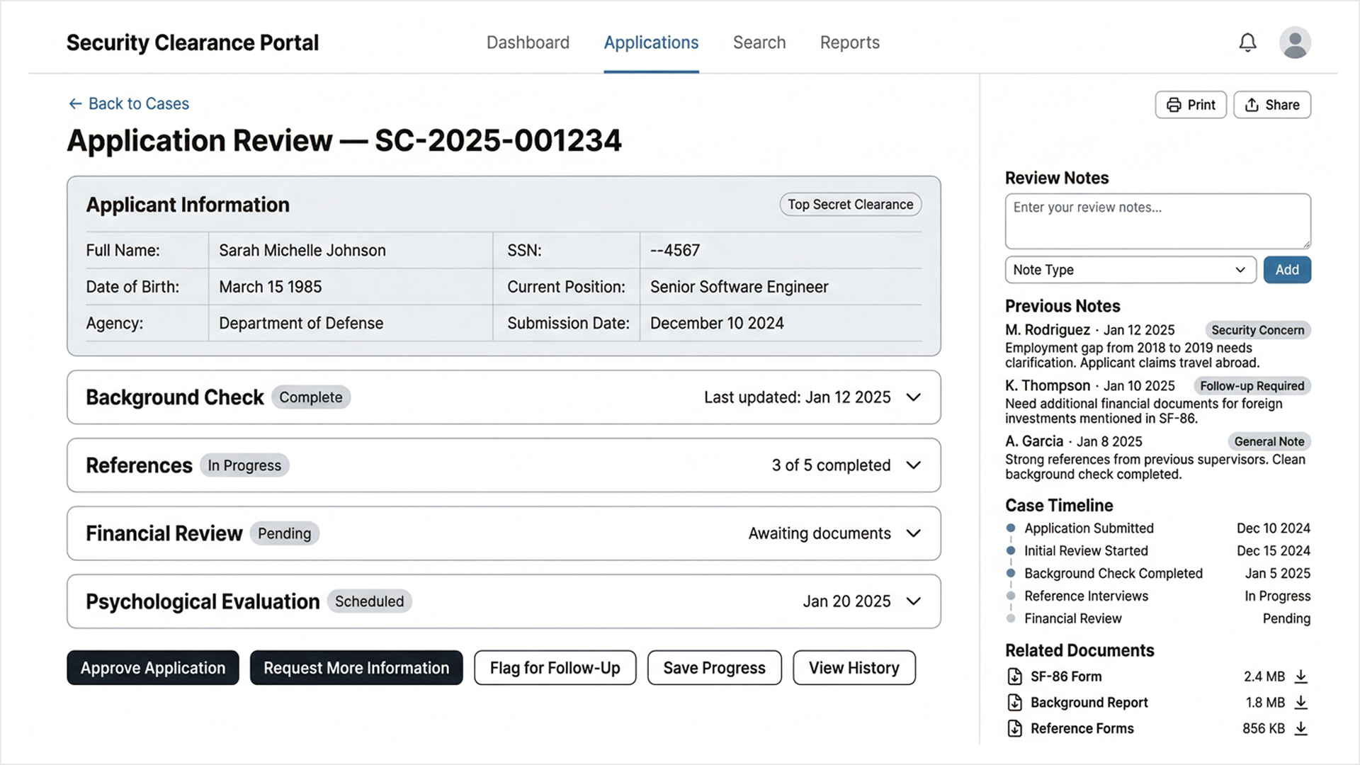
The first was breadcrumb navigation. Every screen in the portal shows the reviewer exactly where they are and provides a clear path back. Moving from the Case Queue into an Application Review shows "Back to Cases" as a persistent navigation element. No reviewer should ever have to wonder how to return to where they started.
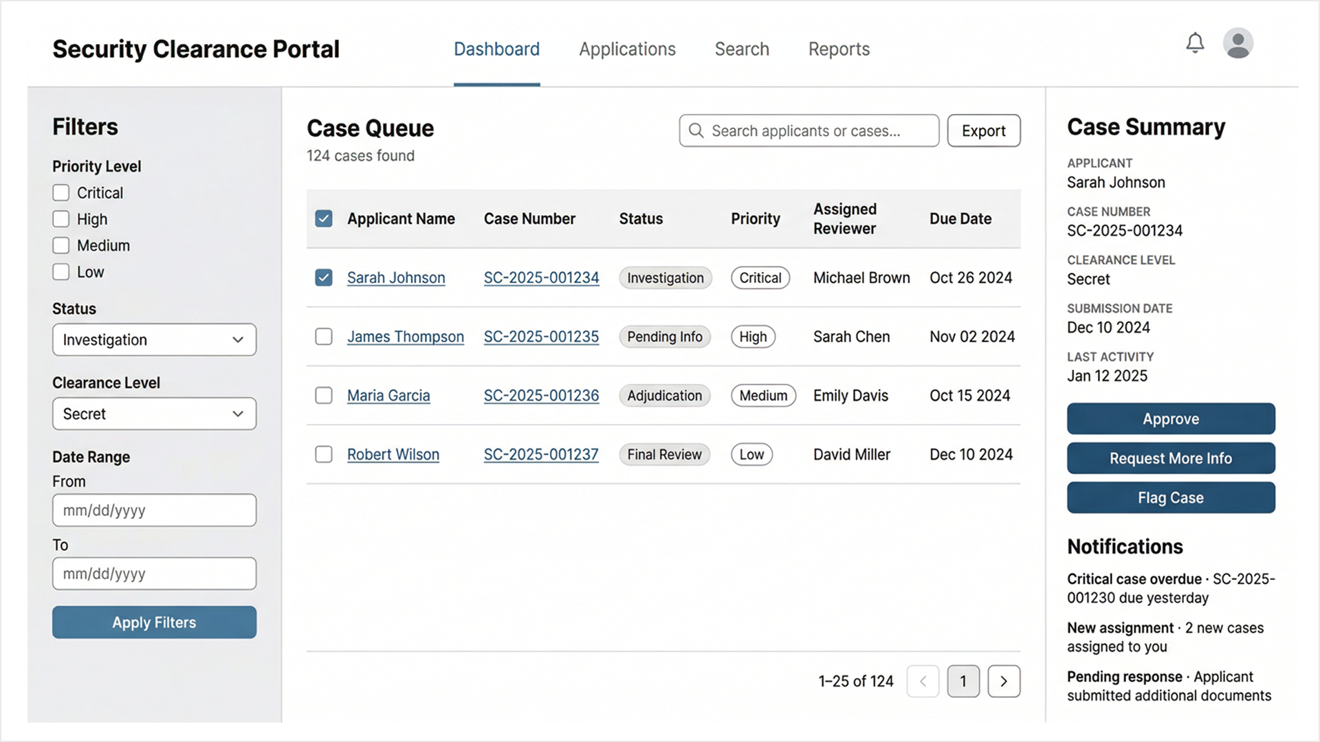
The second was the persistent Case Summary panel. The right sidebar of every case-level screen holds the same information regardless of where the reviewer navigates within that case: applicant name, case number, clearance level, submission date, last activity, and the three primary action buttons: Approve, Request More Info, Flag Case. This information doesn't disappear when you move between sections. It stays, because reviewers need it throughout the process, not just at the moment it's first displayed.
The third was the Case Timeline. Every application review screen includes a vertical timeline in the right sidebar showing every milestone in the case with completed steps marked, in-progress steps noted, pending steps indicated. A reviewer can answer the question "where is this case?" in under three seconds without navigating anywhere or opening any additional panel.
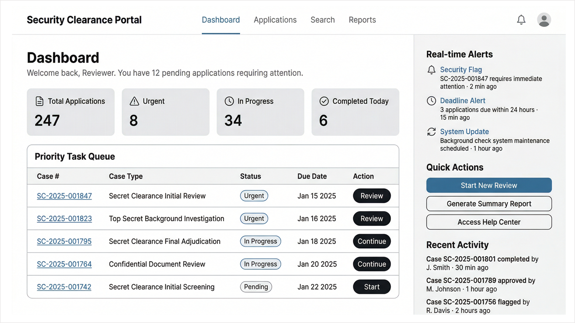
The Priority Task Queue on the Dashboard addressed the workload management problem with reviewers arriving at the start of a shift needed to know immediately what required their attention, in what order, and by when. Urgent cases surfaced at the top with clear action buttons. In-progress cases showed their current state and due dates. The system made the most important next action obvious without requiring the reviewer to construct it themselves.
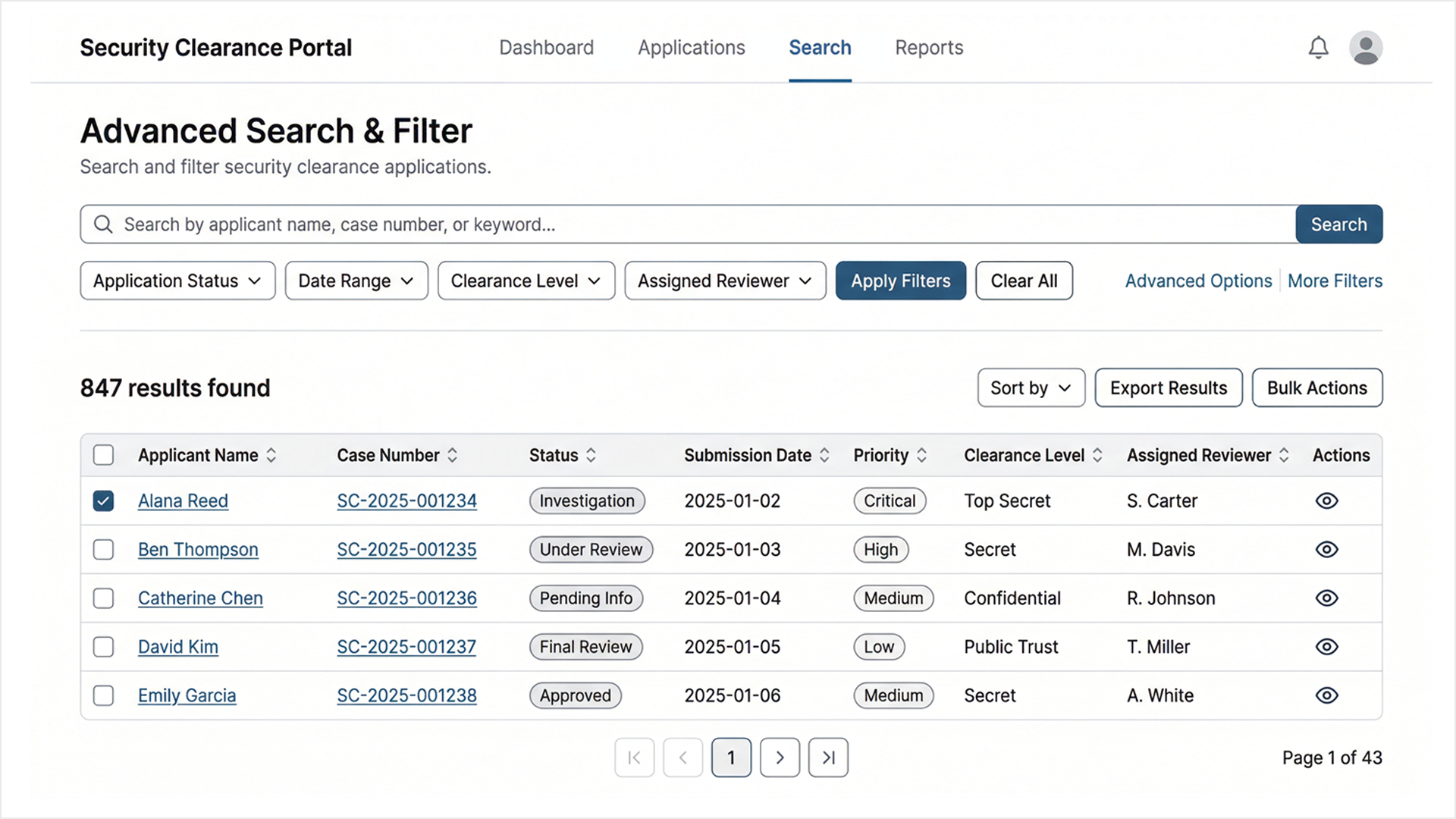
The Advanced Search and Filter system addressed the retrieval problem. When a reviewer needed to find a specific case across 847 active applications, they needed to be able to filter by status, clearance level, assigned reviewer, date range, and priority simultaneously and get a result they could act on immediately.
The Outcome
The research-led approach meant that every major design decision in the portal traces back to something observed in the field rather than assumed at a desk. The breadcrumb navigation, the persistent sidebar, the case timeline all came from watching real reviewers lose their place in a real system and designing specifically to prevent that from happening again.
The portal was built and deployed on ServiceNow. I was not the developer. My role was UX research, user interviews, observational research, wireframing, and design. The collaboration between rigorous research and careful platform-constrained design produced a system that works the way its users actually work, rather than the way a system architect imagined they might.