Exhibit Design UX
The Challenge
Most interactive exhibits rely on the same basic assumptions: users can read, users can tap, and users understand that a screen is something you touch. This project removed all three.
The brief was to design a gesture-based hawk flight game for a regional nature center, intended for children as young as six years old. Players would control a hawk on an eight-by-five foot display using only their body, for example: arms up to ascend, arms down to dive, arm extended left or right to turn. No touchscreen, no buttons, and no instructions written in any language. The system had to teach itself to every child who stood in front of it, in under a minute, without words.
The Constraint That Shaped Everything
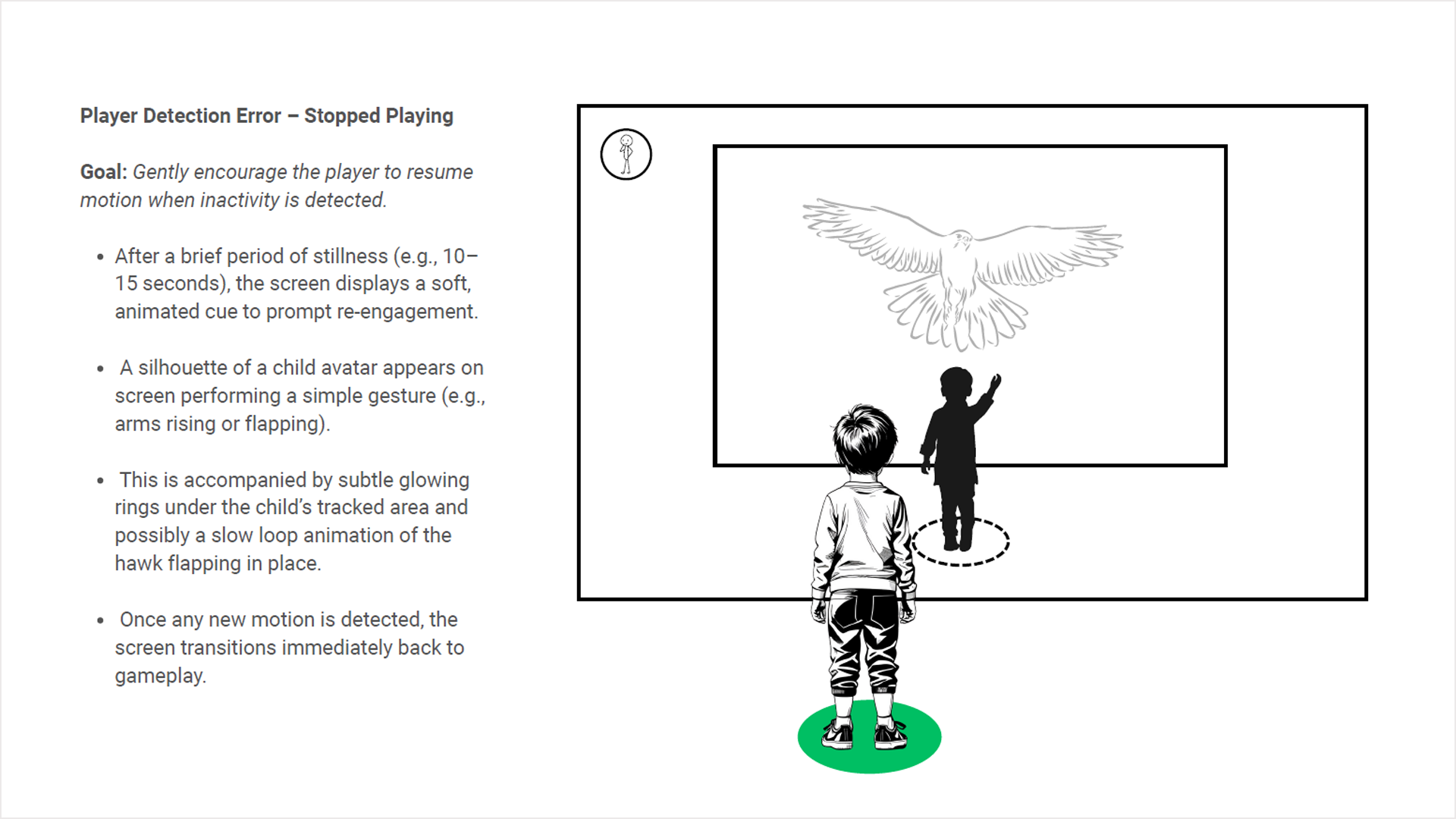
The no-written-language requirement was a functional necessity. A nature center exhibit serves an enormously varied audience including children who can't yet read and children whose first language isn't English. This meant that every piece of communication the system needed to do, like teach the gestures, confirm the child was being tracked, signal success, signal failure, indicate progress, handle errors all had to be accomplished entirely through motion, imagery, and visual feedback. The design vocabulary was body language, color, and animation.
The Approach
The core design problem was sequencing: how do you teach a child to control something with their body when you can't tell them what to do?
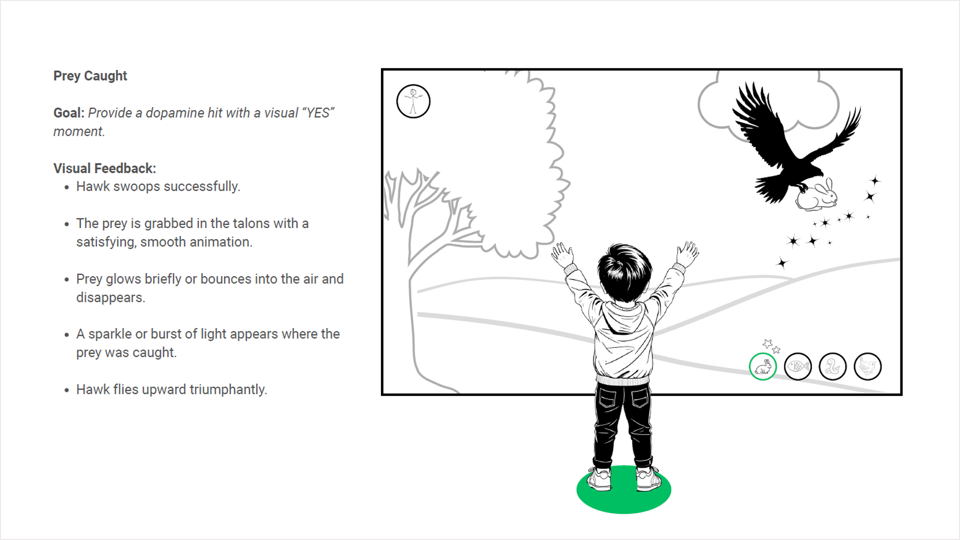
Each gesture state was designed as a distinct, readable physical pose: arms fully raised for ascent, arms angled down and forward for dive, single arm extended horizontally for directional turns. The poses were chosen for their clarity as silhouettes, legible from the child's peripheral vision on screen as a ghosted prompt without requiring them to look away from the game.
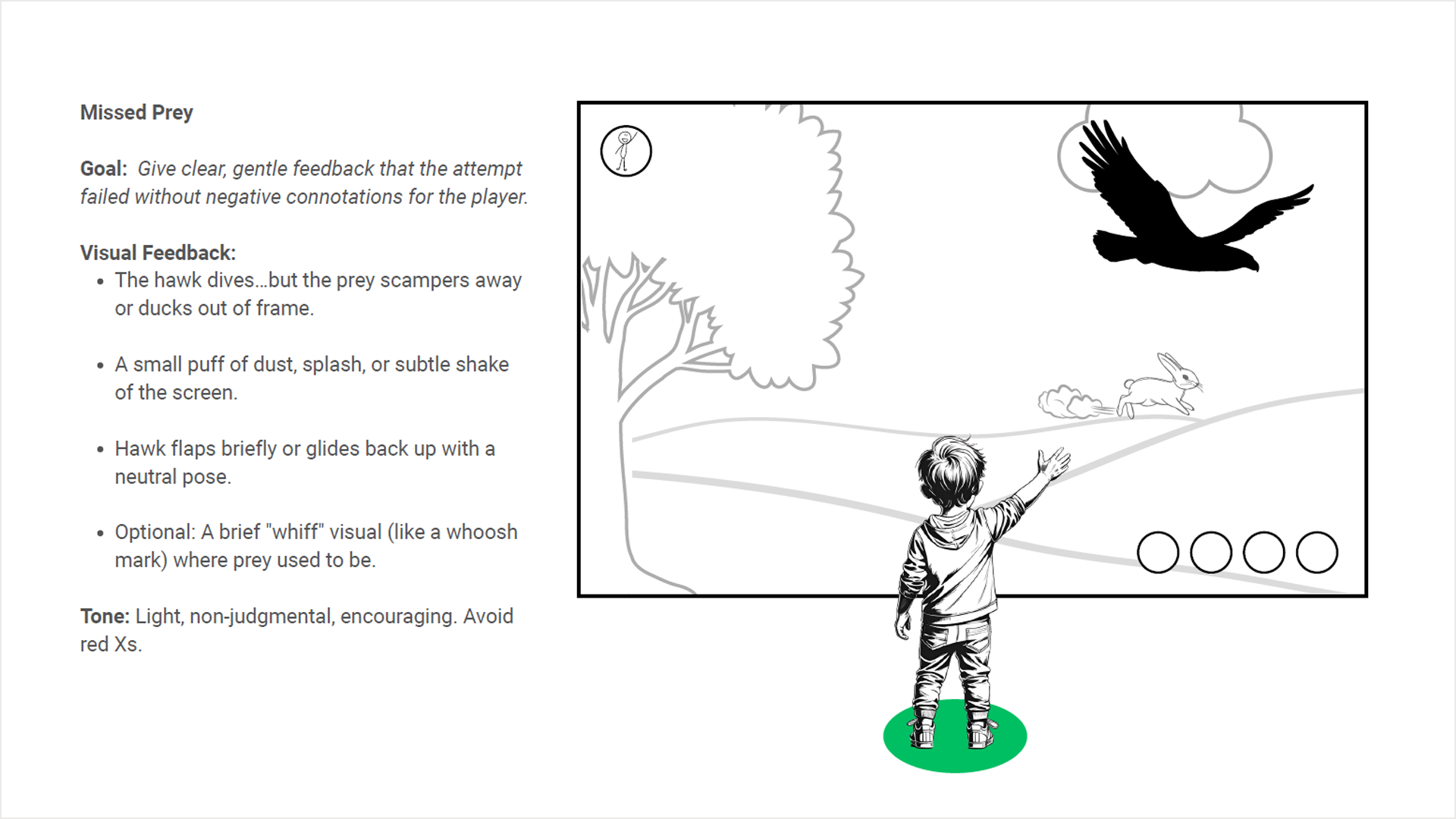
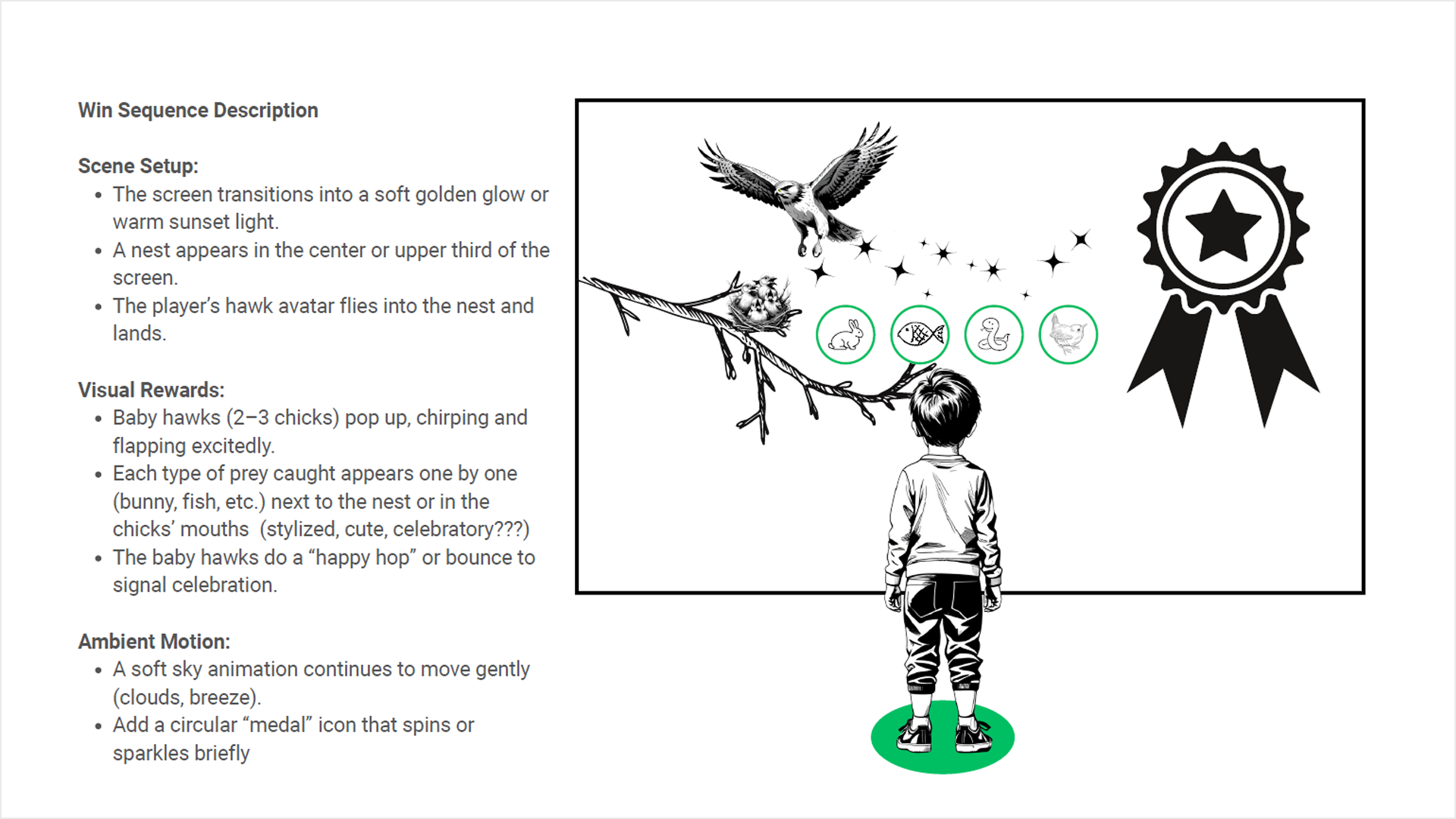
Failure states were designed with particular care. A child who misses prey sees the hawk glide back up with a neutral pose and a subtle dust puff where the rabbit was—there was no red X, no alarm, no indication that something went wrong. The tone throughout is non-judgmental: the game resets gently and invites another attempt. For a six-year-old, the difference between an error state that discourages and one that re-engages is the difference between a child who walks away and one who tries again.
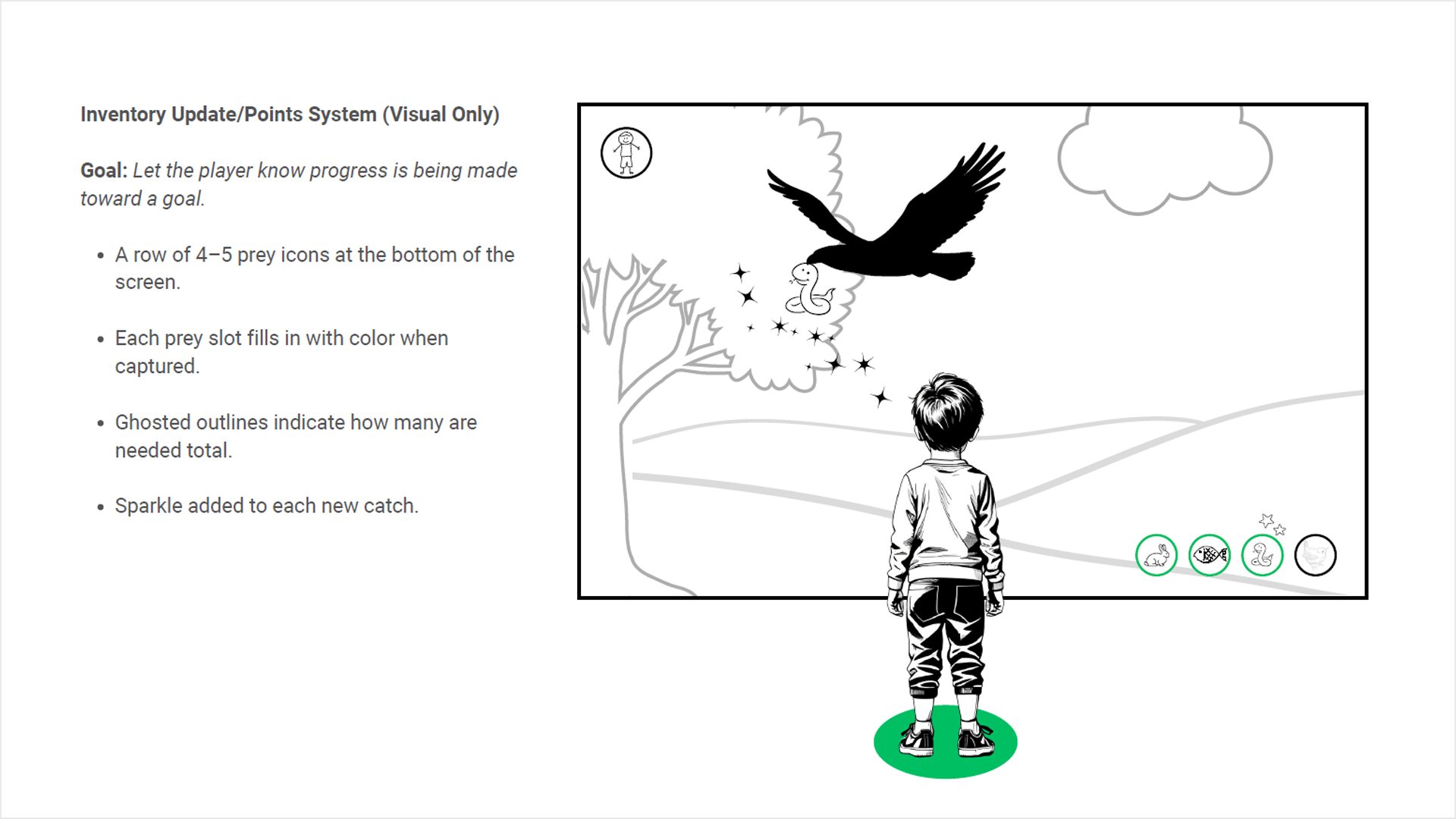
Progress was communicated through a row of prey icons at the bottom of the screen with ghosted outlines that fill in as each animal is caught. A child who can't count can still understand that circles are filling up and that something good is happening.
The Outcome
The result was a complete interaction system built entirely from motion, imagery, and cause-and-effect feedback without text, touch, or prior knowledge required. The system onboards a child in approximately thirty to forty-five seconds and transitions seamlessly into gameplay. It works for non-readers, for children who have never played a video game, and for visitors who speak any language.
It is also, in my experience, one of the purest UX problems I have worked on. When you remove language entirely, every design decision becomes about whether the system is actually communicating, figuring out whether the experience itself is legible.